I design the work and the system behind it. If you need faster, sharper output without losing the brand, get in touch.
Book a 20-min Fit Call
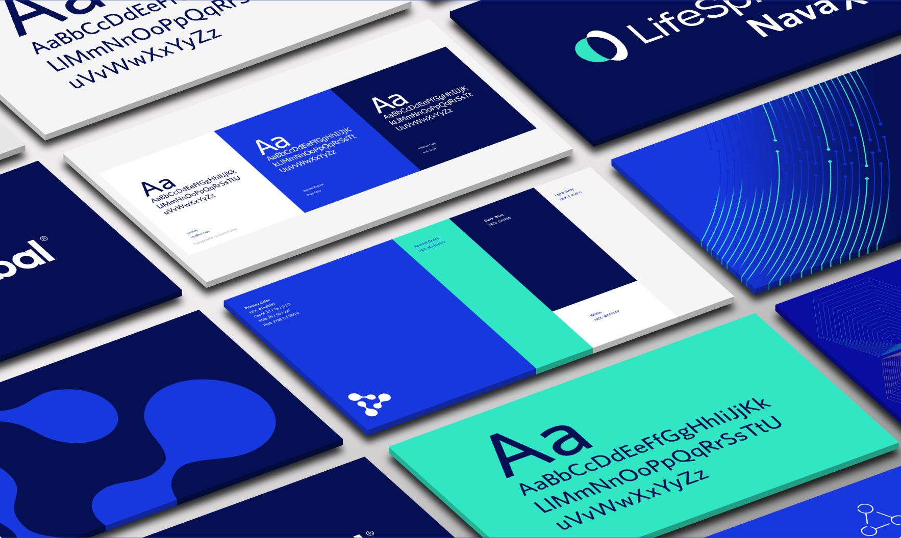
ArisGlobal evolved from a single master brand into a corporate brand behind a product suite: LifeSphere. The challenge was not just a visual refresh. It was building a usable brand system across sales, marketing, web, and partner channels.
Why it mattered
The shift to LifeSphere introduced a real hierarchy problem: teams needed to market and sell the product suite clearly while still maintaining ArisGlobal as the corporate umbrella. Without a usable system, old names, mixed logos, and inconsistent visuals would keep resurfacing, creating friction in sales and confusion in the market.
Brand hierarchy confusion across corporate and product-suite usage.
Global consistency across regions, vendors, and partner-produced materials.
Sales enablement needs that required fast updates without slowing pipeline.
Make the rules usable: guidelines that read like instructions, not a museum.
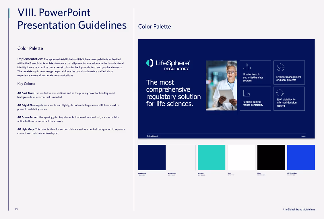
Embed the brand in tools: PowerPoint and document templates with locked styles and preset palettes.
Rollout as enablement: partner with sales and marketing to replace legacy materials and help teams choose the right brand.
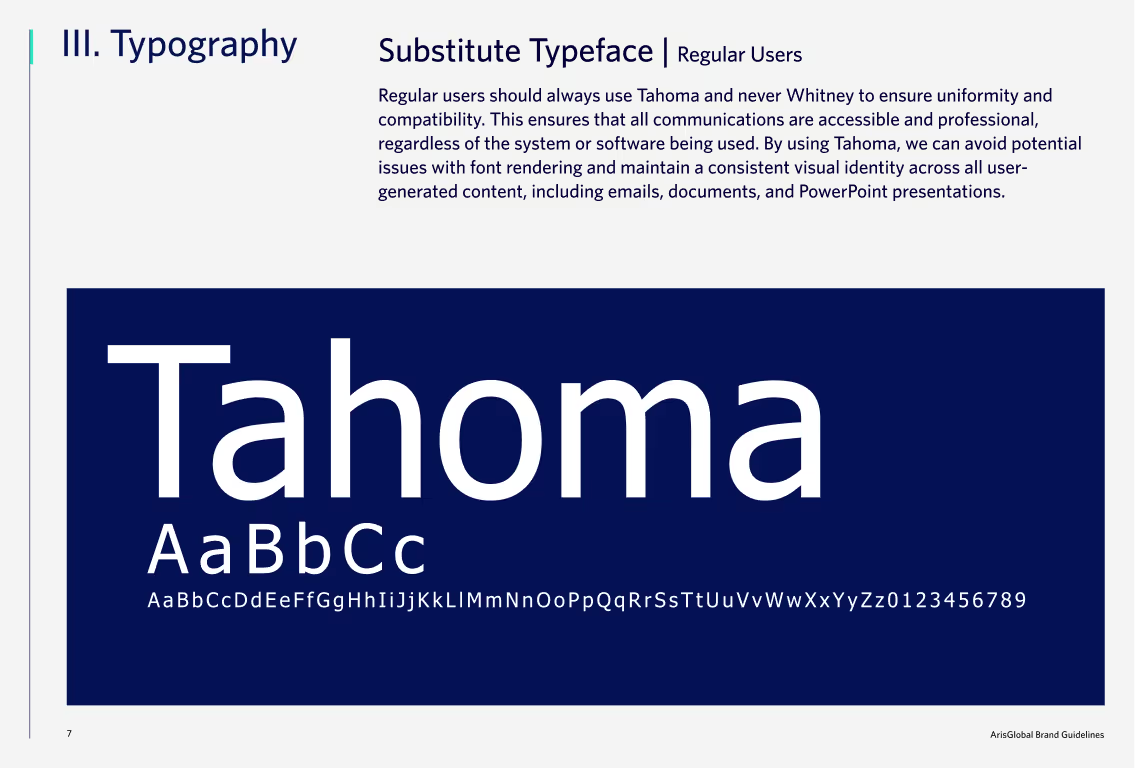
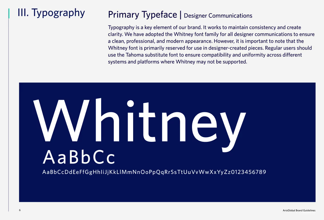
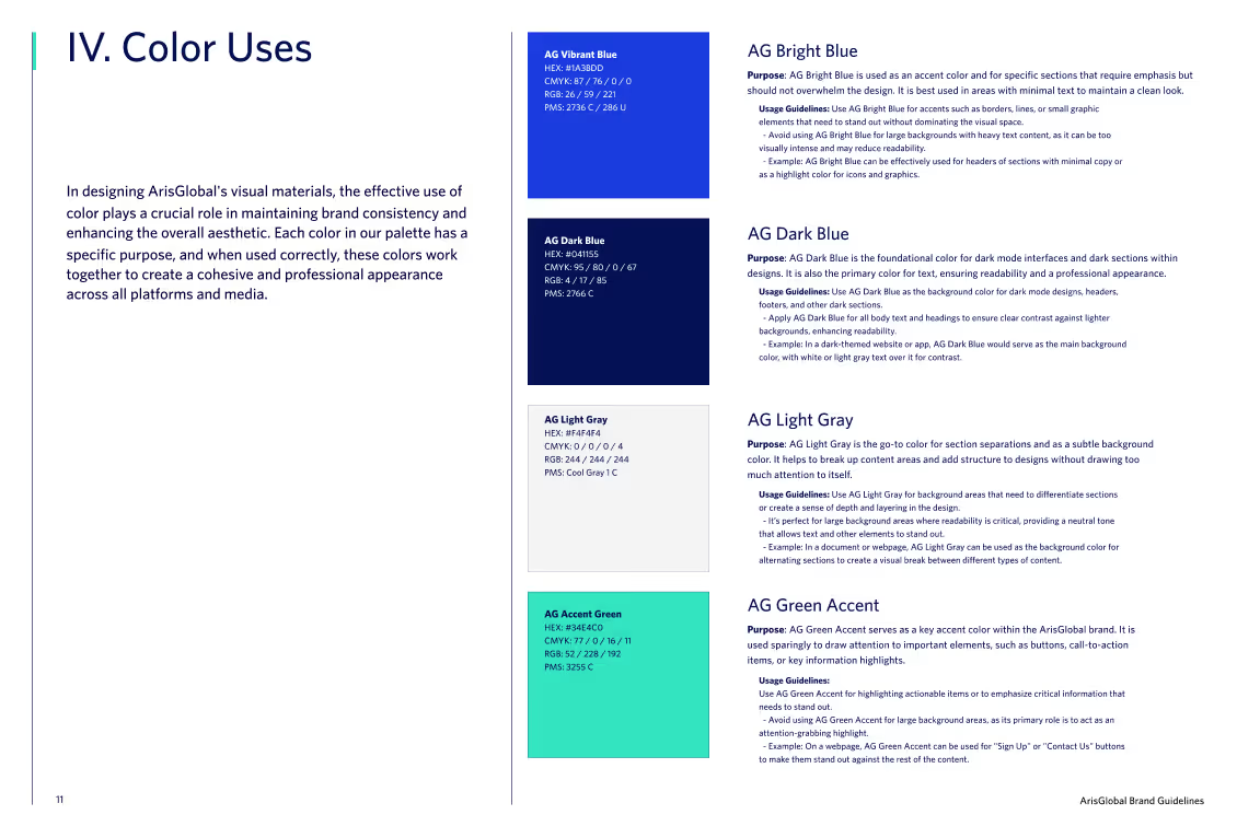
The guidelines were designed as a working toolkit rather than a static rulebook. Clear do’s and don’ts, explicit typography and color rules, and built-in PowerPoint quality checks helped regional teams self-serve while staying compliant and on-brand.
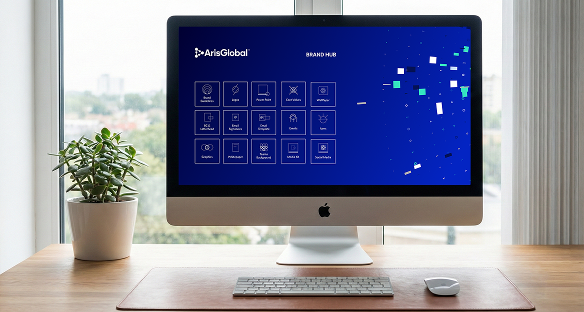
To support adoption, I built a Brand Hub in SharePoint, aligned to the team’s Microsoft workflow. It centralized approved logos, iconography, templates, product guides, brand guidelines, and image libraries, reducing asset hunting and making the system self-serve for regional teams.
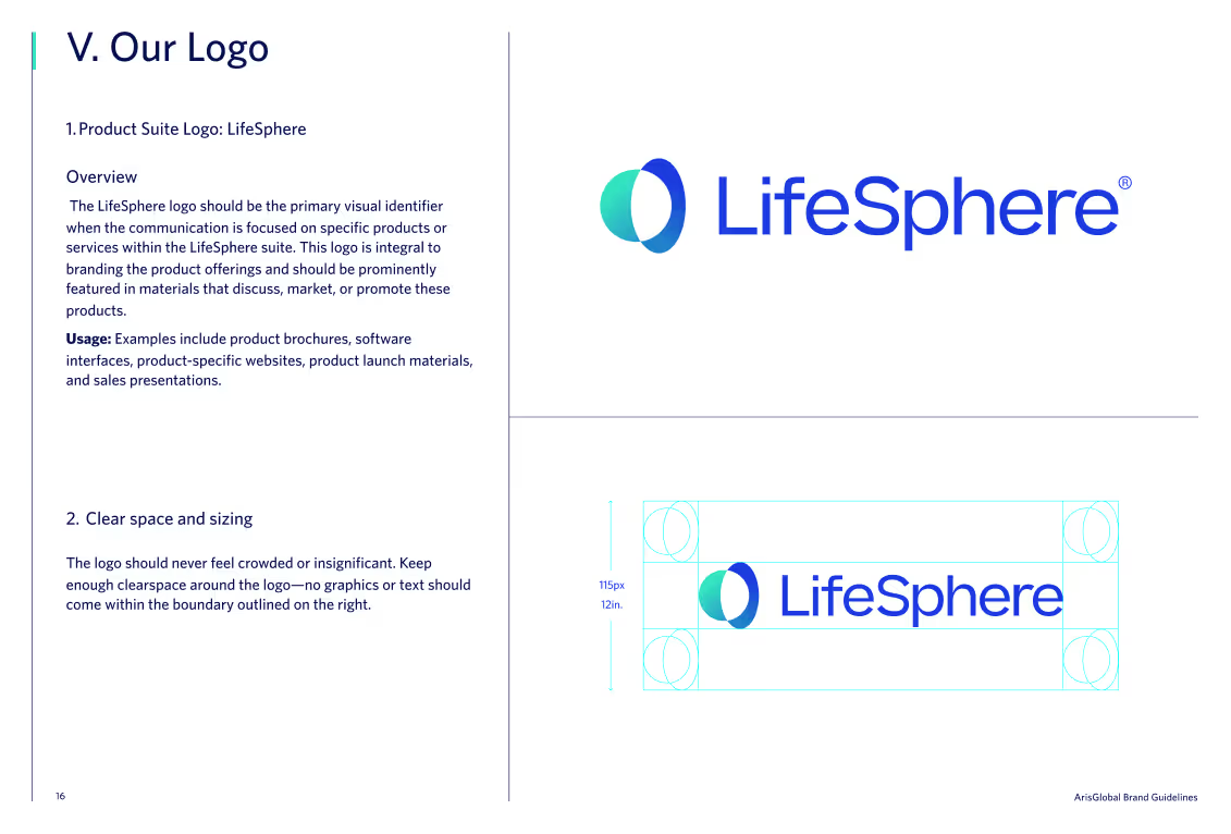
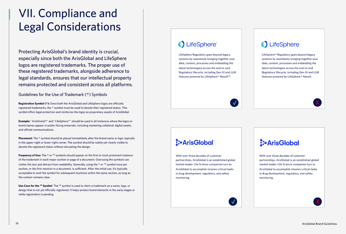
Logos and lockups for both corporate and product-suite usage.
Product naming rules and supporting guides.
PowerPoint templates and enablement components, approved iconography and illustration styles, and image usage guidance.
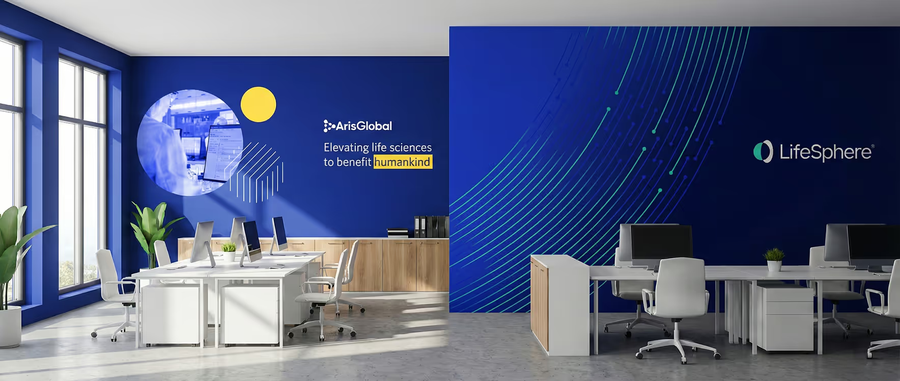
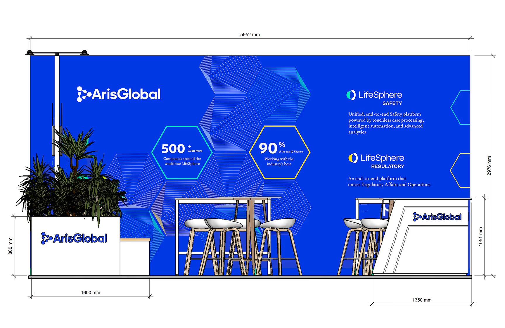
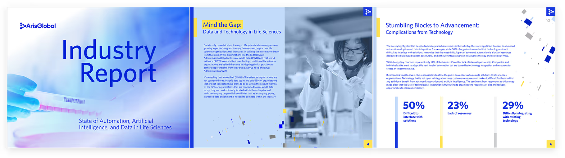
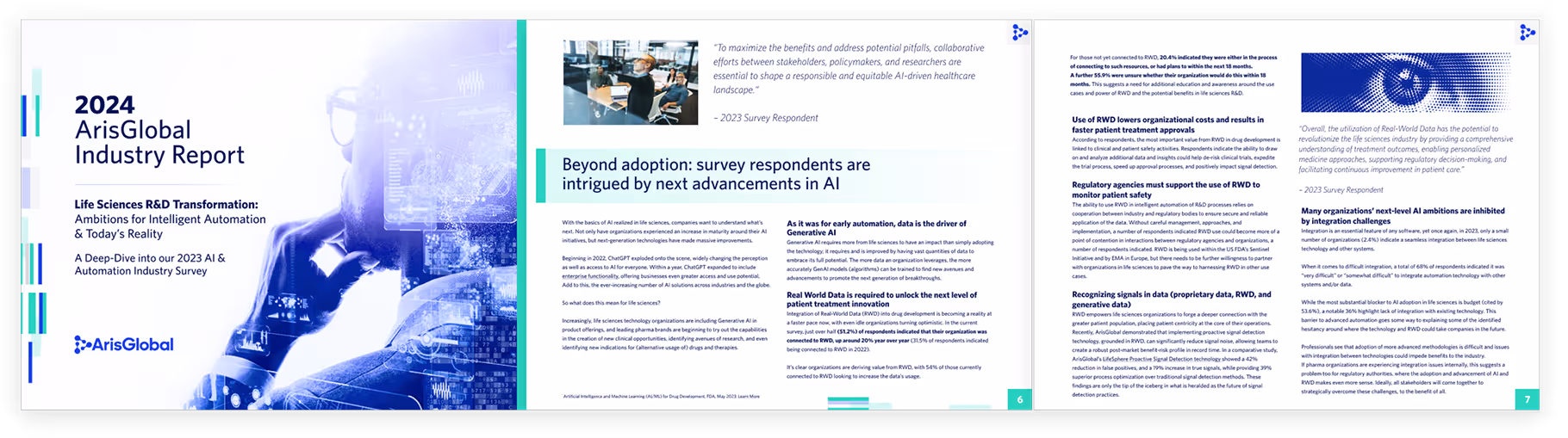
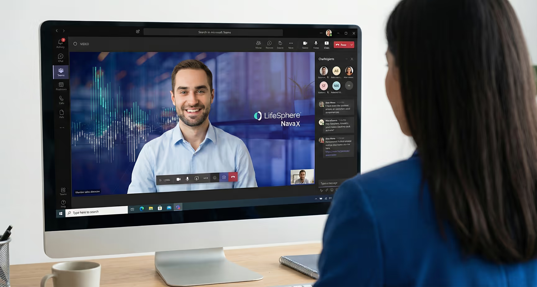
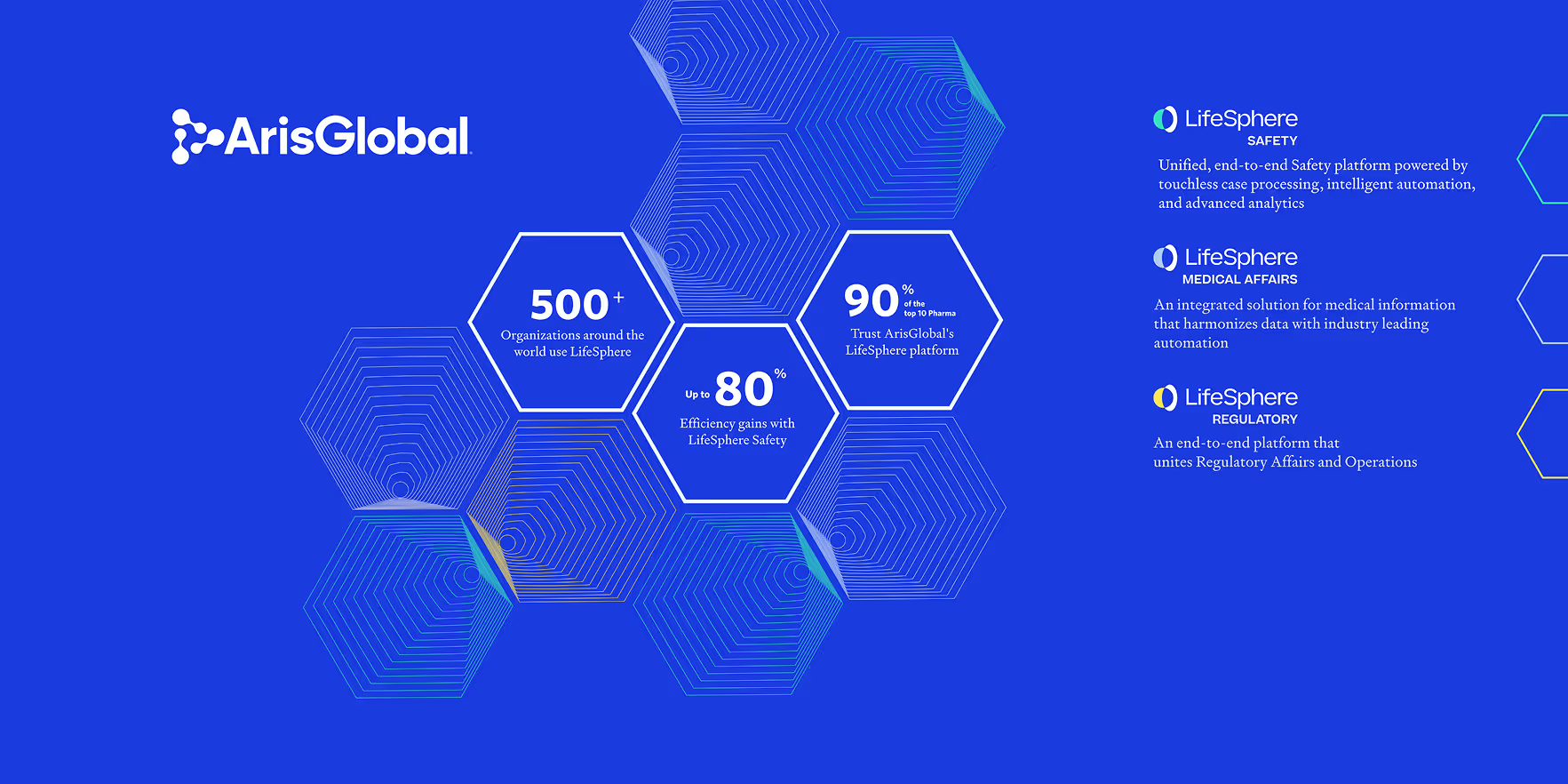
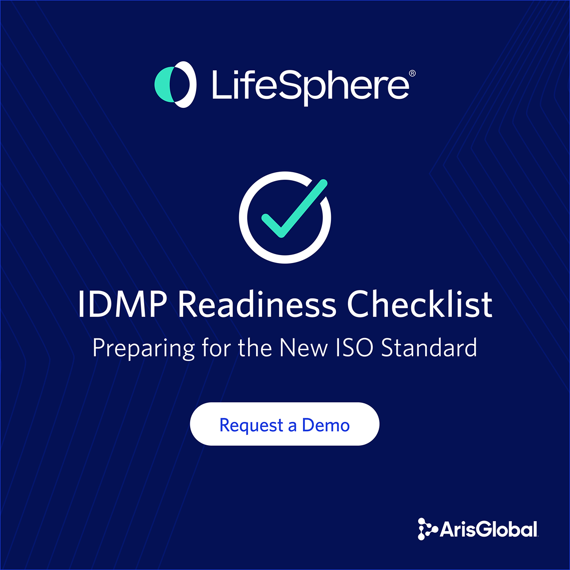
A selection of outputs created under the system, designed for consistency at speed across formats, regions, and teams. The goal was not one polished asset at a time, but repeatable components that could hold up across real production needs.


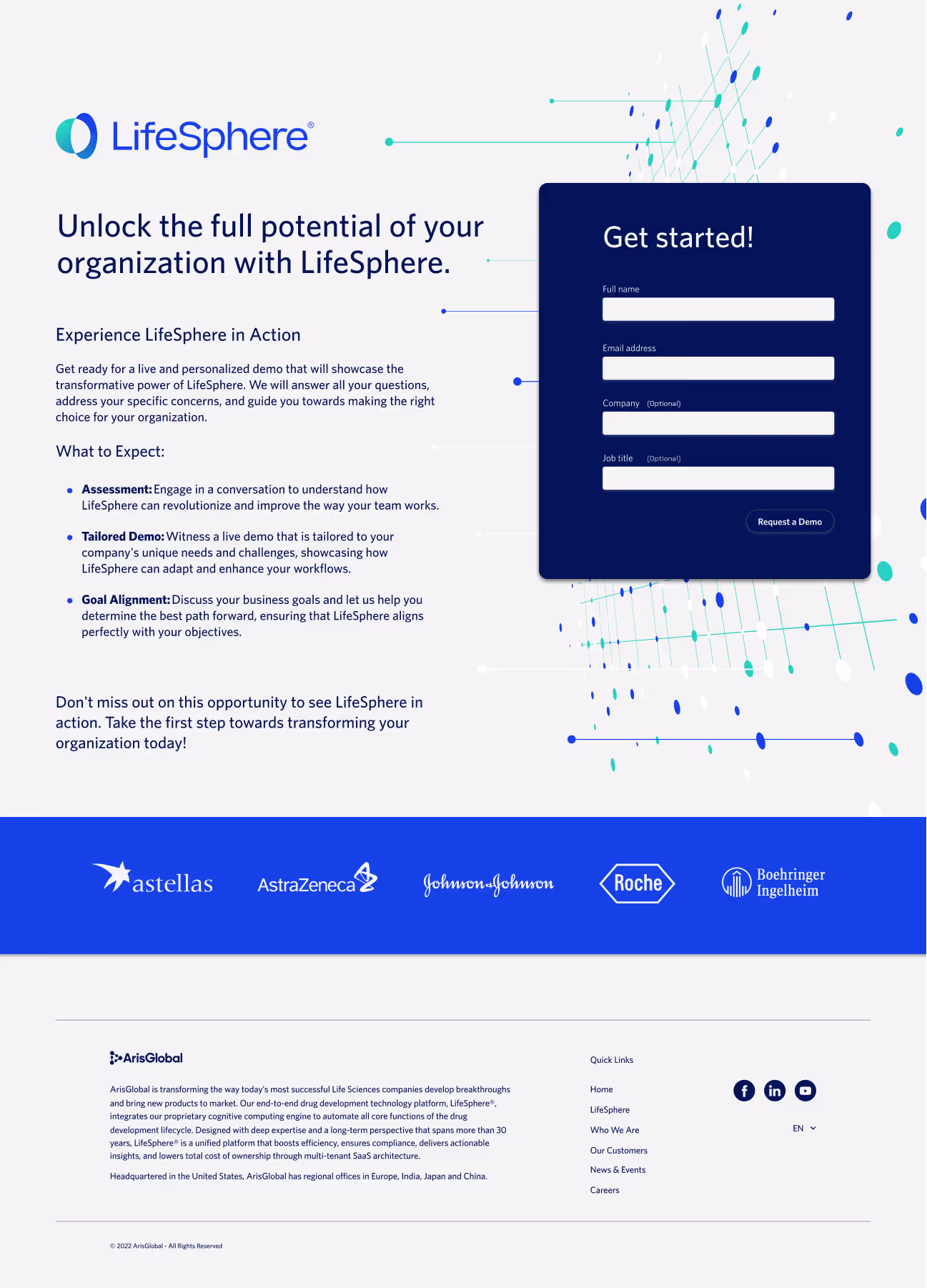
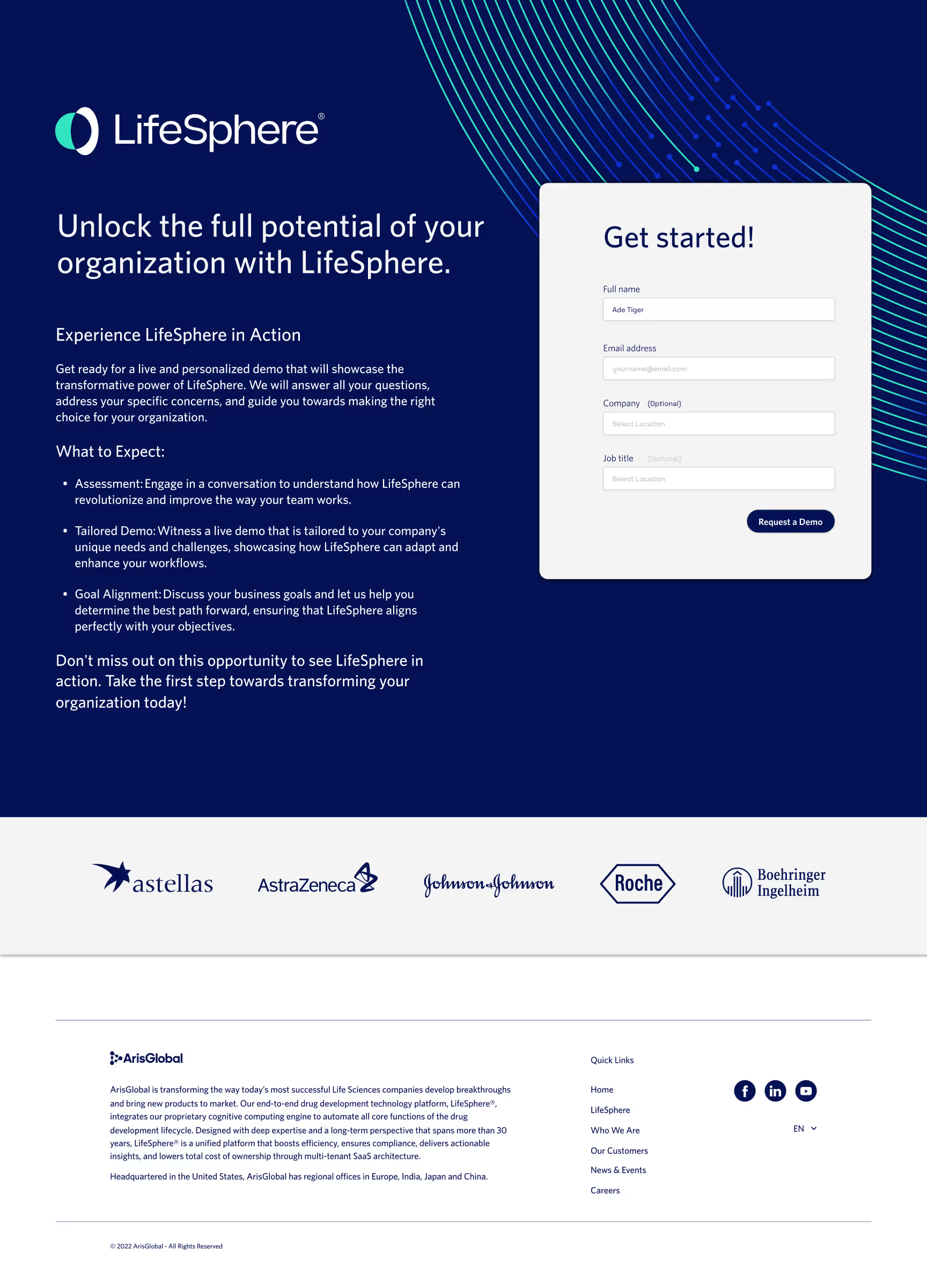
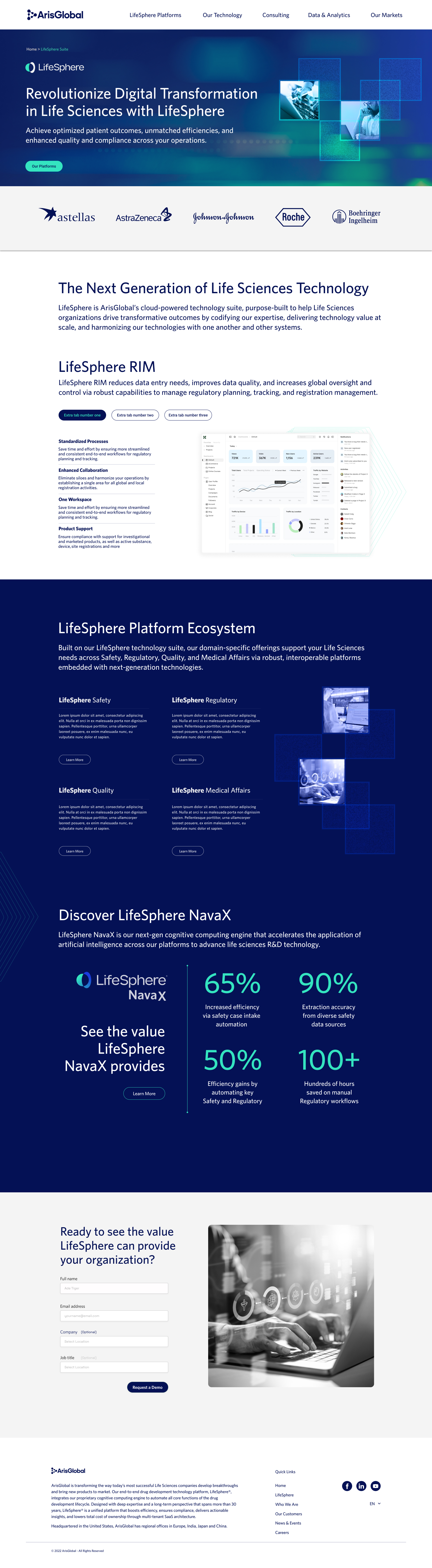
I designed the full website in Figma across desktop and mobile using a modular section system intended for WordPress implementation. The structure supports ongoing maintenance through reusable blocks and clear hierarchy, helping the experience stay consistent as content evolves. Note: the live implementation evolved after my tenure; the work shown here reflects the intended design system and layout behavior.


I led the rollout in partnership with the CMO, managed two junior designers, and supported marketing, sales, web, and external partners across regions.
The result was more than a rebrand. It was a usable operating system: clear rules, governed templates, production-ready assets, and a Brand Hub that made adoption possible at scale while reducing day-to-day brand drift.