I design the work and the system behind it. If you need faster, sharper output without losing the brand, get in touch.
Book a 20-min Fit Call

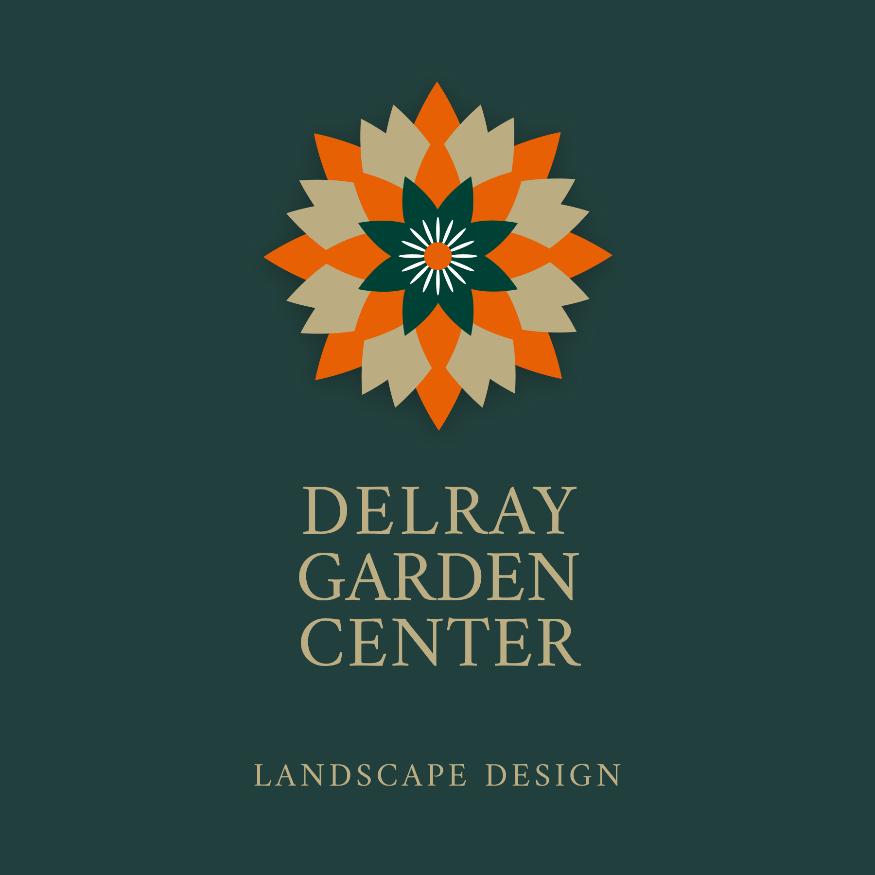
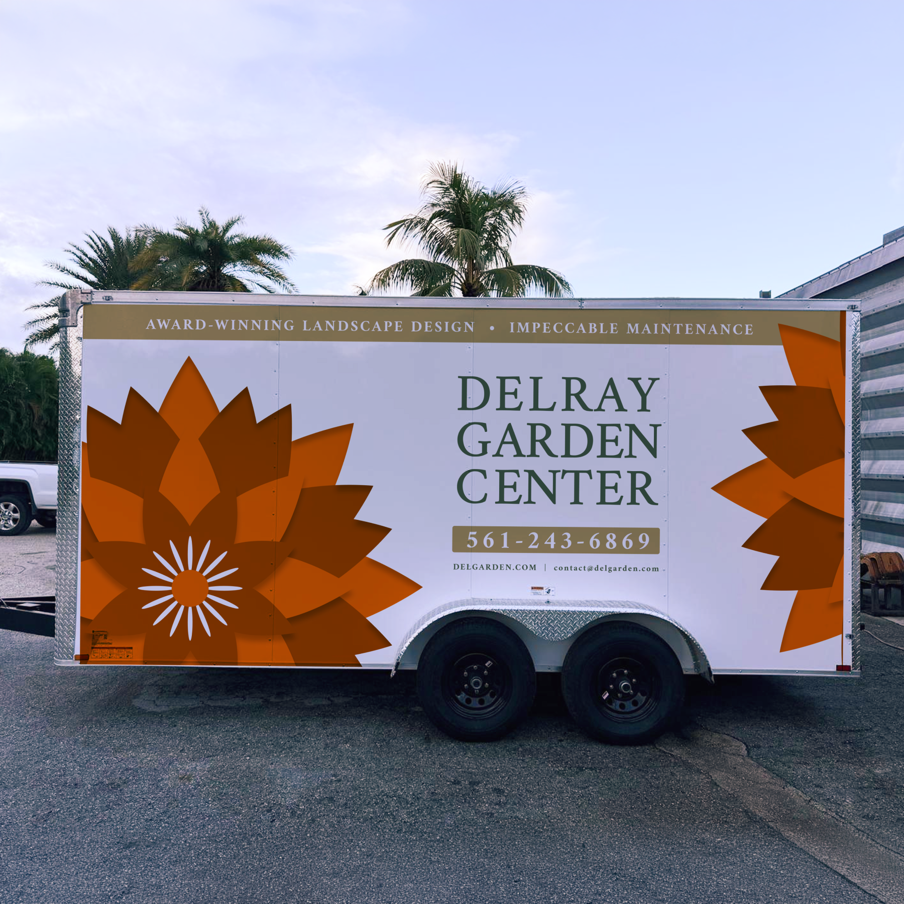
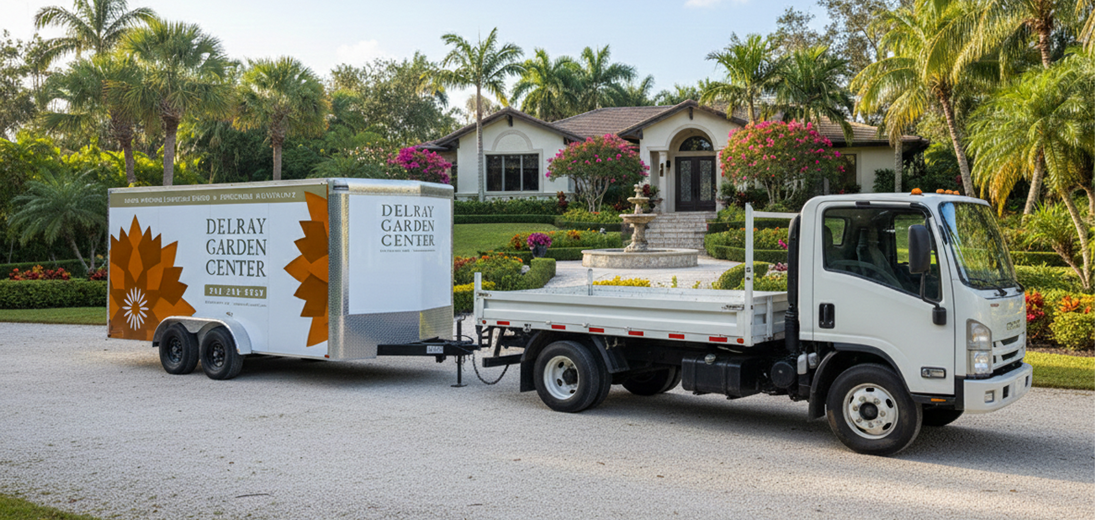
Delray Garden Center needed a modern identity that could scale across trucks, trailers, signage, and wayfinding without losing consistency. I built a simple, production-ready layout system designed to stay clear and legible across sizes, surfaces, and materials. To keep the brand maintainable over time, I also set up a locked Signs.com template catalog so the team can reorder assets and stay on-brand without redesigning from scratch each time.
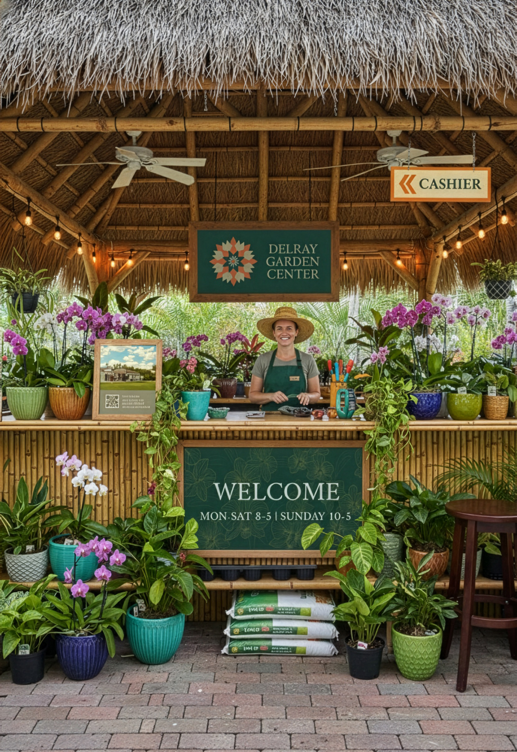
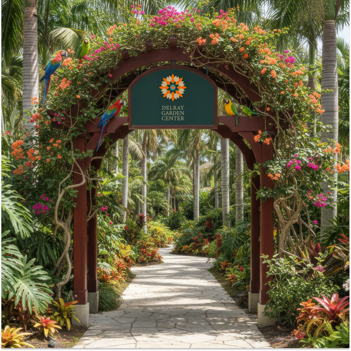
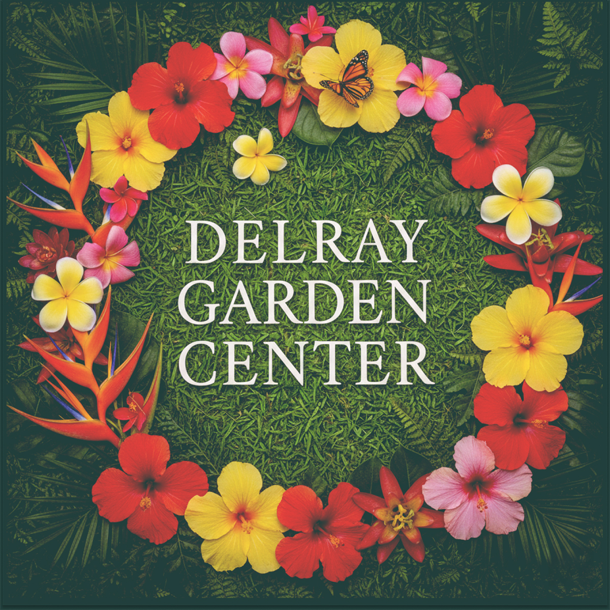
A quick competitive scan made the problem obvious: local garden brands were a sea of palm trees. Delray wanted a more modern, design-led identity that would still work in the real world, from storefront signage to vehicle decals. I built the concept around a geometric dandelion mark, an extended earth-tone palette with sand neutrals, green, and terracotta accents, and Amiri as a warm, legible serif. The result was a simple layout system that stays consistent across vendors, sign sizes, and materials while holding up in high-contrast outdoor use.

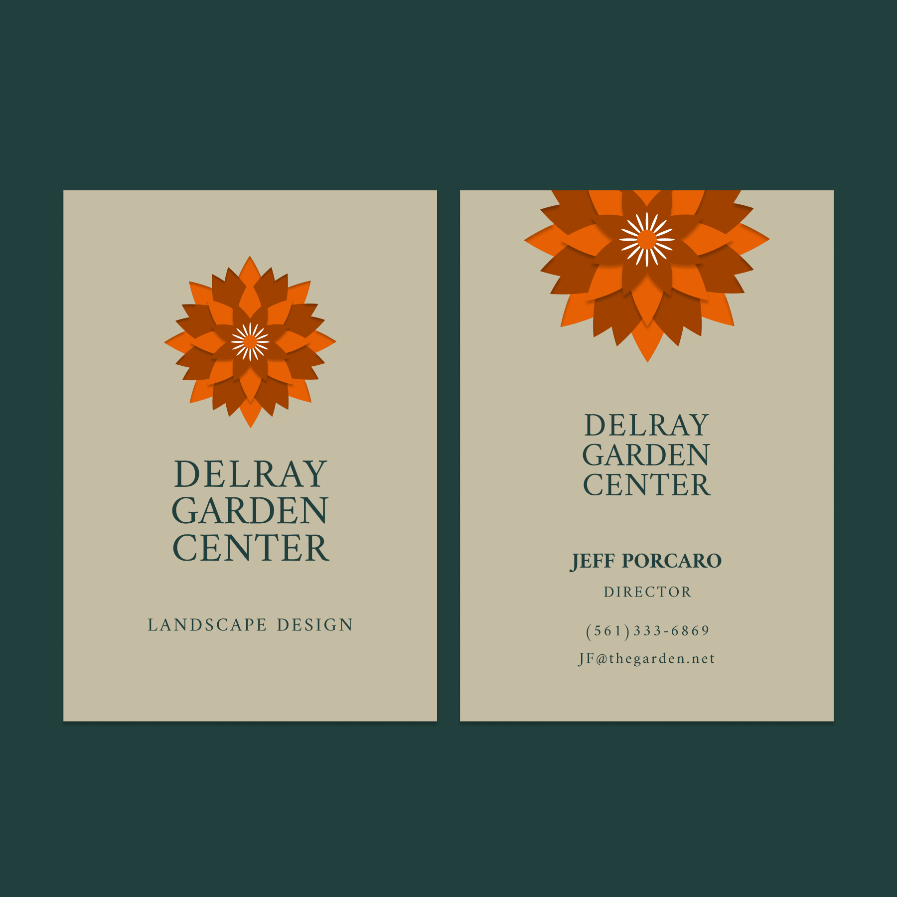
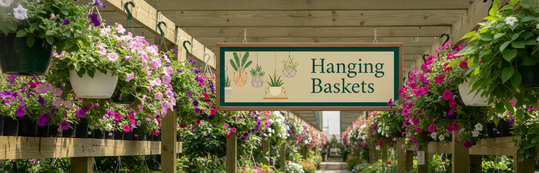
I built a practical identity system that extended beyond the logo: signage layouts, modular truck and trailer branding, and print-ready files with clear specs for vendors.
To make the brand easy to maintain, I also created a Signs.com catalog with locked, reorderable templates so the team can produce new pieces and reorders without drifting off-brand.
This was not just a brand refresh. It was a repeatable kit with clear rules for spacing, typography, and hierarchy, plus flexible layouts that work across different sign sizes, materials, and environments.
The system stays legible at a distance, holds up across vendors, and remains consistent over time because the easiest output is also the correct one.
I led the project end to end: concept, identity design, layout system, production files, vendor handoff, and the Signs.com setup that keeps the brand running without rework.


I led the project end to end: concept, identity design, layout system, production files, vendor handoff, and the Signs.com setup that keeps the brand running without rework. The main lesson is simple: a brand only scales when the system behind it is as strong as the visuals. Clear rules, durable templates, and production-ready files are what keep consistency alive after launch.